
Manual / Personalising the app
Colour and accessibility
- For
- a controller, and anyone who cannot separate the shipped colours
- Status
- current
- Covers
- Colour palette, My colours and My saved palettes, in ⚙ Settings → Appearance
- Last checked against the app
6f7727e(2026-08-19)
Several things in this app are colour-coded: how late a bus is running, how far a gap between two buses has drifted, how much of a road is shut, how much headroom a bridge leaves. About one man in twelve cannot separate the shipped red from the shipped green. This page is what you can change about that, and the two rules the app will not let you break.
What you are looking at
⚙ Settings → Appearance holds three colour controls.
Colour palette — a list of four:
| Option | What it is for |
|---|---|
| Default | The palette the app ships with |
| Red–green safe | For deuteranopia and protanopia, the two most common. Leans teal, blue, amber and magenta, with severity still ordered by darkness |
| Blue–yellow safe | For tritanopia. Keeps the red–green axis and moves "early" to violet |
| High contrast | Every band darkened well past the legibility floor, for bright rooms and projected screens |
My colours — a grid of individual swatches, grouped by what the colours mean, with a sentence over each group saying so:
| Group | What it colours |
|---|---|
| Buses on the map | The tracking dot for each live bus, by how it is running: On time (bus), Early (bus), Late (bus), Very late (bus), No prediction (bus) |
| Lateness, written down | The same bands wherever they are printed as words — the departure board, the bus panel, the punctuality views |
| Gaps between buses | The headway bands: On headway (text), Watch (text), Alarm (text) and Unknown (swatch) |
Each swatch is drawn as the thing it colours — a bus dot with its white outline for the map colours, a time in that colour for the written ones — because a colour in a list is unreadable and a colour drawn as a bus dot answers "which one is this?" without being asked. Beside each is the contrast it measures, as a ratio, and the word changed where you have moved it from the palette's own value.
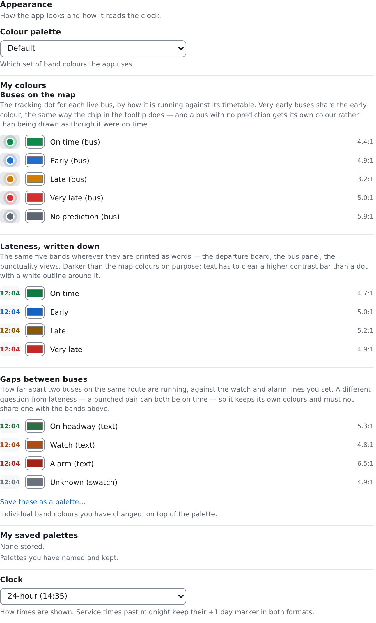
My saved palettes — a count of the palettes you have named and kept. The palettes themselves are listed at the foot of My colours, each a button that applies it and a × that deletes it.
Making your own
- Pick the palette that gets you closest, in Colour palette.
- Change individual swatches in My colours. Your changes sit on top of the palette, so nudging one band does not silently drop you back to Default.
- Save these as a palette… at the foot names the result and keeps it. A saved palette records every colour, not just the ones you moved, so it still means the same thing after the app's own defaults change.
- Clear my changes throws away your individual swatches and leaves you on the palette you picked.
Applying one of your saved palettes puts the app on Default and lays your saved colours over it — that is what a saved palette is: a complete set of your own choices, not a fifth palette the app ships.
A colour below its floor is refused, not warned about
Change a swatch to something that cannot be read where it is used and the app will not take it. The colour reverts, and a line appears under that swatch giving the contrast you asked for, the contrast that colour needs, and what to do about it:
3.10:1 — needs 4.5:1. Pick a darker colour.
There is no "I understand the risk" button, and that is deliberate. The same floors are checked when the app is built, on the colours it ships. A palette you build is held to exactly the same rules as the ones the app ships — the guard is a property of the app, not of who chose the colour.
Two different floors, because two different jobs. A colour that is text has to clear a much higher bar than a colour that is a dot on a map, and that is why a band can have two colours that look different from each other: the written "Late" is darker than the bus dot "Late (bus)" on purpose. A text colour dark enough to read on a white panel is mud on a map, and a map colour bright enough to see on a basemap is illegible as a word.
Map colours are judged against the white outline every symbol on this map is drawn with, not against the basemap. Nothing else would work: you can switch the basemap from Street to Dark at any moment, and no strong colour clears a fixed bar against both. The outline is what separates the symbol from whatever is underneath it, and the fill only has to be distinguishable from the outline. So the rule for a map colour is at least as legible as the one it replaces — you cannot make things worse, and you are not asked to clear a bar the shipped palette itself could not.
The whole-palette rules
Two more rules are about the palette as a whole rather than any one colour, so they cannot be shown under a single swatch. They appear as a block of errors at the top of My colours:
- Lateness and headway must not share a colour. A green that means "on time" and also "on headway" is two different measurements wearing one colour, and neither can be read. They are different questions — two buses can both be twelve minutes late and be running a perfect gap.
- Watch must stay lighter than Alarm. Severity has to survive as lightness alone, for a reader who cannot separate the hues at all. If watch is darker than alarm, the worse of the two no longer looks worse.
These two are reported rather than refused. Unlike a contrast failure, a palette that breaks one of them is still saved, with the complaint standing at the top of the editor until you fix it. Read the block; it names both colours.
Why a palette has to recolour the map
A palette that made the words safe and left the map alone would be answering in the easiest place and ignoring the hardest.
The written bands are four words on a panel. The map is up to fifteen hundred bus dots at once, and it is the surface a controller reads at a glance, from across a room, without stopping to check a label. A red–green-safe palette that darkened the text and left the dots red-and-green would look like it worked and would fix nothing that matters.
So every one of the four palettes moves the bus dots as well as the words, and the swatch grid puts Buses on the map first for the same reason.
The other map colours are not offered yet, and they are not forgotten. Road closures, clearance bands, stop dots and the congestion ramp are all checked against the same floors when the app is built, but changing them would not take effect until the page was reloaded — and a control with a hidden reload requirement is worse than a control that is not there. The bus dots are the exception because the map has always repainted those as you work.
What they do not mean
A palette does not change what a band is. Recolouring "Late" does not move the line between "on time" and "late", and there is no setting in this app that does. Which band a bus is in is fixed; only its colour is yours.
A palette is yours alone. Nobody else's screen changes, and a colleague you send a link to sees their own colours. If you are describing something over the radio, name the band and not the colour.
"High contrast" is not a bigger-text setting. It darkens colours. It does not change type size, and your browser's own zoom is still the answer for that.
The contrast number beside a swatch is not a quality score. It is a measured ratio against the surface that colour actually lands on — for a word, the palest panel it is ever printed on; for a bus dot, its own white outline. A larger number is not a better colour, only a more legible one.
Colour is never the only channel in this app, and a palette does not change that. Every coloured band prints its number or its name beside it, the Timetable's heatmap carries a texture as well as a hue, and the headway ramp darkens in both directions from the middle. A reader who cannot use any of these colours can still read every screen.