
Manual / The timetable
The Allocation view
- For
- a planner building a retime case, and a controller asking where a route loses its time
- Status
- current
- Covers
- the Timetable tab's Allocation view — the Showing scope bar, the stop ladder, the Δ column and the group runs within ± control
- Last checked against the app
6f7727e(2026-08-19)
Allocation answers one question: which runs am I looking at, and where does their time go? It takes a route's scheduled running time apart, stop by stop, so that "the PM peak takes 64 minutes instead of 43" becomes the eight or nine stretches of road that absorb the difference.
Nothing switches it on and nothing is loaded for it. Pick a route and the view is there.
What you are looking at
Two things stacked: a bar that chooses which runs, and a ladder that shows where their time goes.
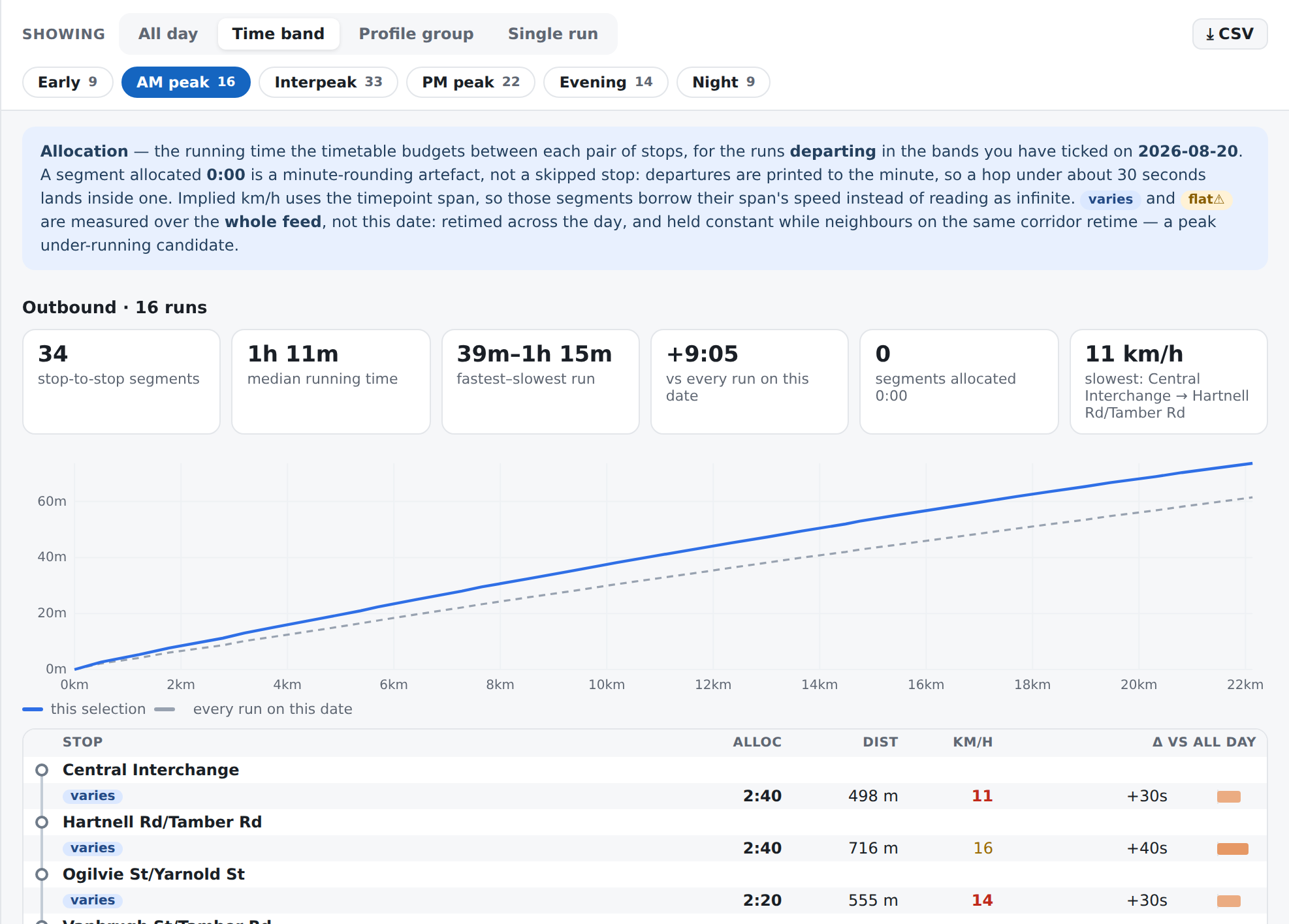
The scope bar
A label reading Showing, four buttons, and a ⤓ CSV button on the right. Only one scope is active at a time.
| Scope | What it selects | Its own control underneath |
|---|---|---|
| All day | Every run of the day, in each direction | none |
| Time band | The runs departing in the bands you tick | Six chips, each with the number of runs in it |
| Profile group | The runs the timetable gives about the same total running time | A chip per group, plus group runs within ± and compare with |
| Single run | One run | A Run: dropdown with ‹ prev and next › |
The six time bands are Early (05:00–07:00), AM peak (07:00–09:00), Interpeak (09:00–15:00), PM peak (15:00–18:00), Evening (18:00–21:00) and Night (21:00–05:00). A band with no runs on this date is shown greyed rather than removed, so the row of chips does not change shape as you move the date. You can tick several, and you cannot untick the last one.
A profile group is a set of runs the timetable gives roughly the same total running time. Each chip is labelled with that time — "45–48 min", or "64 min" where the group is one length — and carries the number of runs in it. Groups are listed one row per direction. A chip can also carry short, which means those runs do not cover the whole route, or skips stops, which means some run in the group misses stops inside its own span.
The Run: dropdown names each run by what it does — its start and finish times, how long it takes, and its destination — and adds "skips 2 stops" or "short working" where either applies. ‹ prev and next › walk the day one departure at a time, which is usually the question: show me the run before the one that breaks. They stop at the ends of the day rather than wrapping round.
The ladder
One row per stop, and between every pair of stops a row carrying the hop:
| Column | What it is |
|---|---|
| Stop | The stop's name |
| Alloc | The running time the timetable budgets for the hop out of that stop. Under it, the fastest and slowest run in the scope, and — where they differ — how many of the scope's runs actually measure this hop |
| Dist | How far the hop is |
| km/h | The speed that time and that distance imply |
| Δ vs all day | How this scope's allocation differs from the baseline, as a signed figure and a bar growing left or right from a centre line |
Three badges appear on the ladder:
- no time — this hop is allocated nothing at all across more than 400 metres, and it is marked more strongly over a kilometre;
- varies — the timetable retimes this hop across the day;
- flat⚠ — the timetable holds this hop constant while its neighbours on the same corridor retime by the hour. A candidate for a stretch that is under-allocated in the peak.
Where several hops in a row are allocated nothing, they roll into one cell — "4 stops in 0:00 · 1.2 km" — because the timetable prints one minute for the whole stretch and one cell is what that is.
Grouping and comparing
Under the group chips sit the two controls that build them:
group runs within ± N min decides how close two runs' totals have to be to land in the same group. It starts at ±2 min, and you can dial it from 0 to 15. ±0 means the scheduler's literal profiles — one group per distinct total running time, which on a busy route is twenty-five of them.
compare with decides what the Δ column measures against. It starts at every run on this date; pick another group instead and the column answers a sharper question — what does the PM peak profile do that the interpeak profile does not — which is usually the more useful one for a retime submission. Only groups in the same direction are offered, because two directions have different stop orders and every row would be a difference between unrelated stops.
What the numbers mean
Alloc is what the timetable budgets, not what a bus takes. It is the gap between the printed departure from one stop and the printed departure from the next. Every figure in the scope is a median across the runs you have selected, with the fastest and slowest under it, so the median can say when it is hiding something.
The Δ column measures one part of the timetable against another part. It is coloured by size — warmer for more time, cooler for less, deeper for bigger, scaled to the largest difference on screen. It is not lateness, no bus is involved, and nothing in it is late.
⤓ CSV downloads one row per hop for exactly the scope you are showing, with the date, the route, the direction and the scope on every row so two exports can be merged and still say what each row is.
What they do not mean
A hop with no time in it is minute rounding, not a skipped stop. Departure
times are printed to the minute, so a hop whose true running time is under about
thirty seconds lands inside the same printed minute as the one before it. The
app says this above the ladder in its own words, and it spells the value three
ways for the same fact: the note calls it 0:00, a single such row shows 0s
in its Alloc cell, and a run of them rolls up into one cell reading
"4 stops in 0:00 · 1.2 km". The real signal for a stop a run does not
serve is the stop being absent from that run — which is what short and
skips stops report.
no time is the exception to that. A hop allocated nothing across more than
400 metres is not rounding: it is a stretch with no timing information in it at
all. That is what the badge is for, and why it gets stronger over a kilometre.
— in Dist or km/h means the number was refused, not that it is zero. Either
the route's shape does not place that stop, or the hop came out implausibly long
and the app will not print a distance it does not believe. See
the map looks wrong
for what the app does with route shapes it cannot trust.
A dash in Alloc means "not measurable in this scope". No run you have selected serves both ends of that hop. It is not a zero and it is not a fast hop.
n of N under a figure is telling you the median is thinner than it looks.
It means only some of the scope's runs measure that hop; the rest do not serve
both of its stops.
The Δ baseline is the whole day, not the window. Narrow the time slider to the PM peak and pick a PM peak group, and the Δ column still compares against every run on the date — otherwise the peak would be compared against itself and read about zero. The column header says which baseline it is using.
A profile group is a reading device, not a category the scheduler used. At any tolerance above zero the app is putting runs together because their totals are close, not because anybody scheduled them as a set. Dial it to ±0 if you want the scheduler's own profiles.
varies and flat⚠ are measured over the whole timetable, not this date. They are findings about the published schedule as a body of work. Changing the date does not change them.
Nothing on this view is frozen. Every number is recomputed from the loaded timetable each time you look. Load a newer timetable and they change — unlike a diversion's figures, which are fixed when the record is approved.
Allocation is not punctuality. This view is entirely about what the timetable says. What buses actually did on the road is a different dataset and a different view: Punctuality.
The tolerance is in two places, and they are not the same control
In the view, group runs within ± is in minutes, applies immediately, and lasts for the session.
In ⚙ Settings → Timetable, Allocation grouping tolerance sets the value the app opens with. That one is in seconds, and its help line says so: ±2 minutes is 120 there. It will also accept larger numbers than the view's own control offers, and anything over fifteen minutes' worth is capped at fifteen minutes when the app next opens. So the two boxes are the same setting in two units, and it is the panel that is the odd one out.
The tolerance does not travel in a link. What travels is the group you landed on, matched back by its running time. Send somebody a link to a group and they see that group; if their own tolerance is different the groups around it may be drawn differently, and if nothing close enough exists the view falls back to All day rather than guessing.
When it looks wrong
"Nothing selected — pick one above." The scope needs a choice you have not made. Tick a band, or pick a group.
"No runs are out on the road between …" The time slider is narrowed past this route's service. Widen it — see Reading a timetable.
The Single run button seems to do nothing. With the slider narrowed to a window that holds no runs there is nothing to show one at a time, and the app says so in a brief message rather than switching to an empty view.
The whole ladder is dashes. Either the direction on screen has no runs in your scope, or the route's shape could not be used to place its stops. Check the warning above the view first.