
Manual / Getting started
The screen
- For
- a controller
- Status
- current
- Covers
- the top bar, the banner column, and the Map Explorer's sidebar, map tools and panel dock
- Last checked against the app
0963ac5(2026-08-19)
The app is one browser window with a permanent bar across the top and one of four screens below it. This page walks the furniture, names every piece the way the app names it, and says where each one lives, so that the rest of the manual can say "the Layers panel" and be understood.
The top bar, left to right
It is on screen on all four tabs, and it never scrolls away.

Two of the rows in the table below are missing from that picture, and both are missing for a reason the table gives: the ◀ ▶ Recent ▾ group is not drawn until you switch history on, and there is no account block on a deployment that has no accounts.
| What you see | What it is |
|---|---|
| The Kinetic Melbourne OCC wordmark | Identity. It is not a button |
| Map Explorer · Timetable · Operations Analysis · Diversions | The four tabs. Diversions is absent entirely on a deployment that does not have it |
| ◀ ▶ Recent ▾ | Back, forward and a menu of where you have been. Hidden until you switch history on and have somewhere to go back to — see Finding your way back |
| ? Manual | This manual. It opens in a new tab, because the Explorer is holding a live map and leaving it would lose your place |
| ⚙ Settings | Your own preferences. At a narrow window the word disappears and the gear stays |
| A date, as a small chip | The version of the app you are running: the date its release notes end at. Click it for What's new |
| Your username, your role, Admin Console, Sign out | The account block. Empty on a deployment with no accounts; a single Sign in button when you are signed out |
The four tabs work with the keyboard as one control: Left and Right move along them, Home and End jump to the ends, and Enter or Space opens the one you have landed on. Moving across the bar does not open the tabs you pass — Operations Analysis is a lot of work to open by accident.
Under the bar: the banner column
Full-width notices stack directly beneath the top bar, most serious first. There are four, and each one is explained on The banners, one by one:
- the timetable feed is expiring, or has expired;
- newer data has been loaded on the server;
- an offer to pick up where you left off;
- the app has been updated since you last looked.
Only the top one is ever urgent. The other three can be dismissed with the × on the right, or left alone.
The Map Explorer
The busiest of the four screens, and the one the app opens on. Five areas.
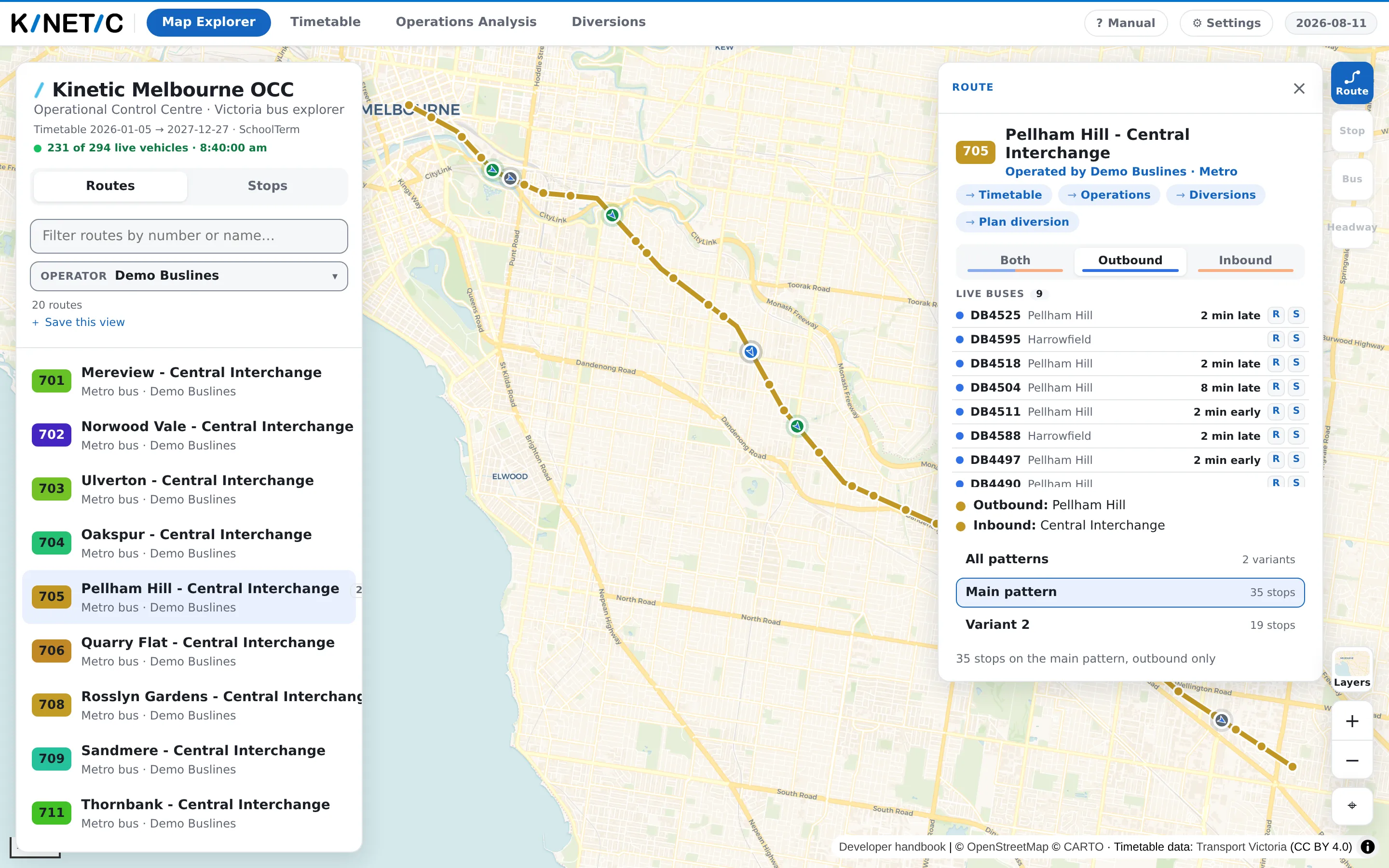
The sidebar, down the left. The heading Kinetic Melbourne OCC and the subtitle Operational Control Centre · Victoria bus explorer, then:
- a line saying which dates the loaded timetable covers, what kind of day today is on the roster calendar (a school term day, a school holiday, a Saturday, a public holiday), and — where observed running times have been loaded — how many days of them there are. Hover it for the exact builds behind those words;
- a live line, present only when this deployment has the live bus feed: how many vehicles are being drawn, and the time the feed itself was generated. When the app's last attempt to fetch the feed failed, the time is replaced by (stale) and the line goes grey;
- Routes and Stops, the two ways to search. Routes gives you a filter box, an Operator filter, a count, your saved views and the route list; Stops gives you a search box that needs two characters;
- the route list itself, which you can walk with the arrow keys.
The map, filling the rest.
The map tools, bottom right. From the top: Radio (only where a station is configured), Layers, the + and − zoom buttons, and a Reset to Melbourne button that puts the camera back where the app opened.
The Layers panel, which the Layers button opens over the map. Three groups: Base map (Street, Light, Dark, and Satellite and Hybrid where the deployment has imagery), Map layers (Buses and Stops, both on to start with), and Overlays (Traffic, Incidents, Clearance, Frequency — all off to start with). Any overlay this deployment has no source for has no tile here at all, and if it has none of them the Overlays group does not appear. At the foot is a button that pins whatever you have switched on as the way the map should open in future.
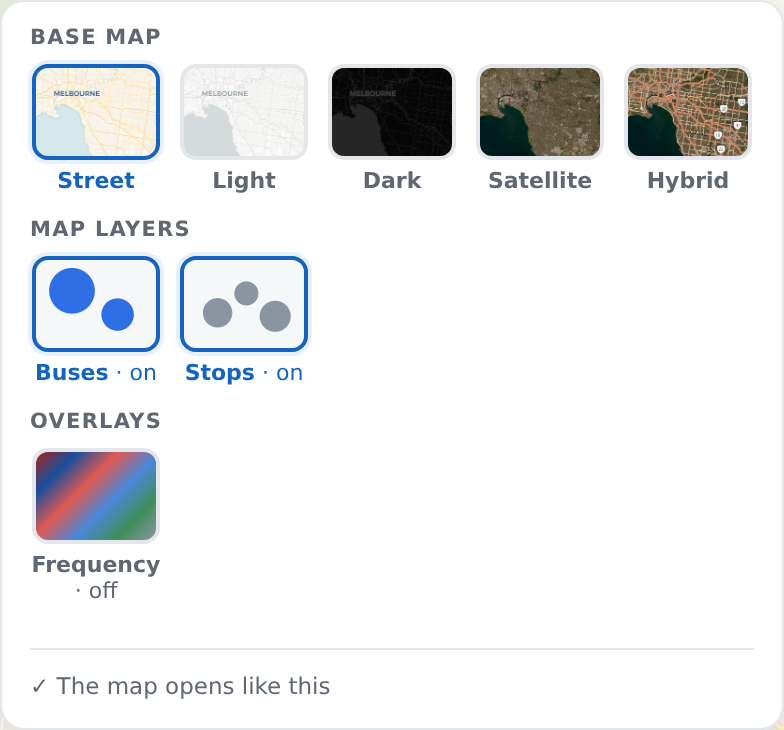
The deployment in that picture has one overlay source, so its Overlays group holds one tile. Yours may hold four, or none at all — which is the rule in the paragraph above, seen from the other side.
The panel dock, down the right, with a narrow rail of buttons beside it. One panel at a time — Route, Stop, Bus, Headway, Affected routes — and a button exists on the rail only while its panel has something in it. The dock is what appears when you select something; the bar along the bottom centre is different, and carries the legend and the controls for whichever overlays are switched on.
The other three tabs
Timetable, Operations Analysis and Diversions each take the whole screen under the top bar. The Map Explorer does not close when you leave it — it is still there behind them, with your route, your panel and your camera where you left them, and switching back finds them unchanged.
Escape closes the most recently opened thing — a dialog before the popover it was opened over, that popover before the banner underneath it. Pressing it repeatedly walks back out the way you came in.
What they do not mean
The version chip is not today's date. It is the date of the release this app is running, which may be weeks ago and is not a fault. If you want to know whether a change has reached this deployment, that chip is the answer.
The live line's clock is not your clock. The time after the vehicle count is when the feed was generated, shown in your local time. It is not the time you last looked, and it is not the age of any one bus — for that, click the bus.
The dates line is the timetable's coverage, not its accuracy. It says which dates the loaded schedule can answer for. It does not say that those dates are still correct, and it says nothing at all about the live feed.
An absent control is not a hidden one. This app draws no dead switches. A missing tile, a missing rail button or a missing tab means the thing behind it is not there — either not configured on this deployment, or not selected yet. Only Operations Analysis stays on screen while unavailable, and it does that so that its absence can be explained in a tooltip.