
Manual / Overlays
Bus frequency and headway
- For
- a controller watching for bunching
- Status
- current
- Covers
- the Frequency tile, the Bus frequency block on the overlay bar, and the Headway panel
- Last checked against the app
6f7727e(2026-08-19)
Are consecutive buses evenly spaced right now? That is a different question from "is this bus on time", it has its own bands and its own colours, and this is the overlay that answers it.
One thing, three names
The tile in the Layers panel says Frequency. The block at the bottom of the map says Bus frequency. The panel that lists the pairs is headed Headway. They are the same overlay; the glossary entry for headway says so too.
What it measures
For two buses running one after the other on the same route, at a stop they both serve:
- what the timetable says the gap between them should be at that stop;
- what the gap actually is, given what the live feed says each of them is doing;
- and the difference — the deviation.
The deviation is exactly the difference between the two buses' lateness. So lateness that both share cancels out: two buses each running twelve minutes down are keeping the gap they were meant to keep, and nothing is raised. That is the point of the overlay, not a shortcoming of it.
It is measured at the next stop the following bus has not yet reached — the next place a passenger actually feels this gap — and where a worse point exists further along the route the row says so, as worse ahead: +9 min at Bell St.
What you are looking at
With no route selected — the network view. The most concerning pairs across the whole network, listed worst-first, each marked on the map with a chevron glyph: pointing inward where the buses have closed up, outward where the gap has stretched. Only Watch and Alarm pairs appear — an even headway is not news.
With a route selected — the route view. Every pair currently running on that route and direction, in every band, each drawn on the map as a coloured span of route between the two buses. On a route you have chosen to look at, "these four gaps are fine" is an answer.
The Headway panel lists them:
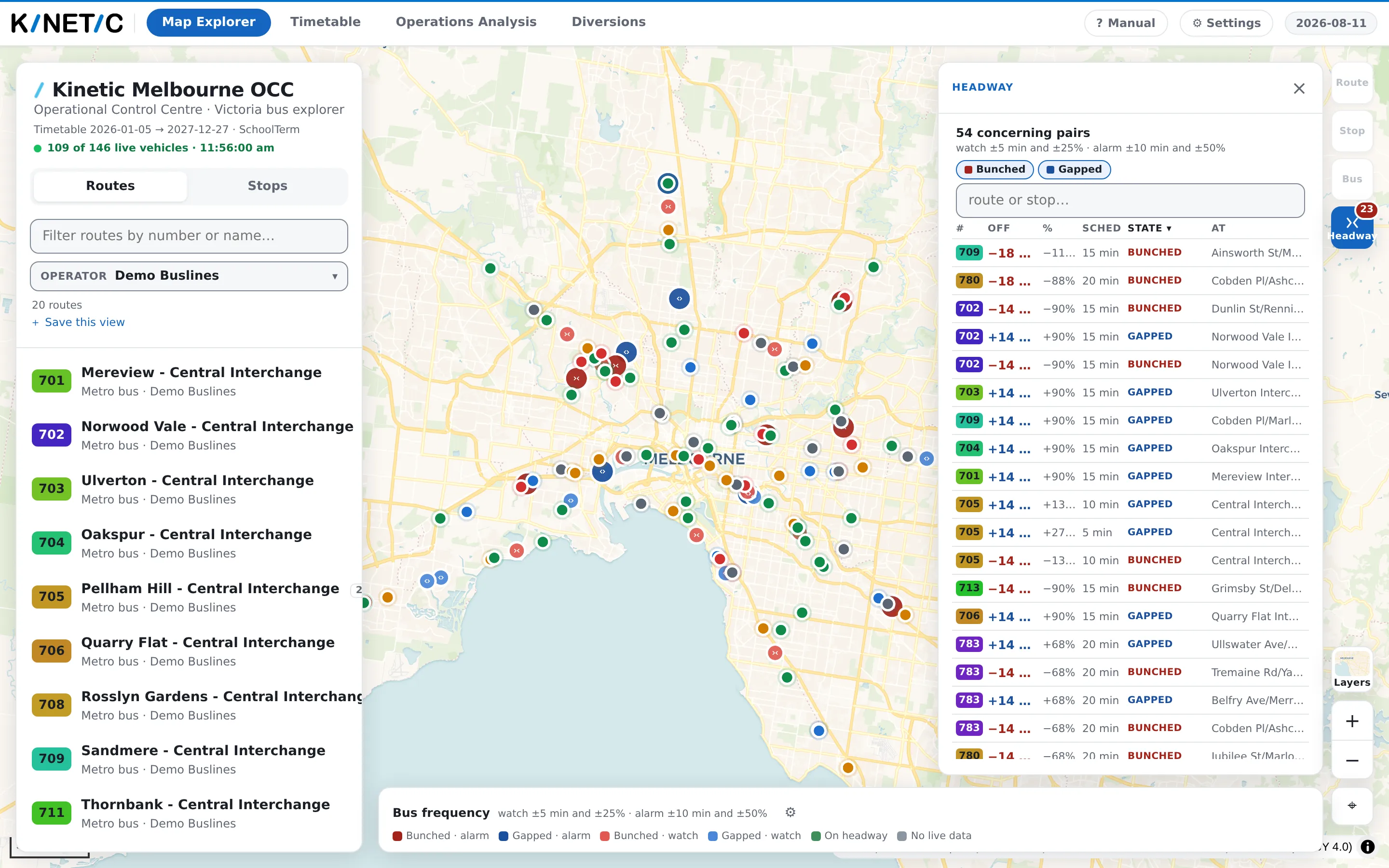
| Column | What it is |
|---|---|
| # | The route |
| Off | How far the gap is from the scheduled gap, signed: +6 min is a stretched gap, −4 min a closed-up one |
| % | That deviation as a share of the scheduled gap |
| Sched | The gap the timetable scheduled at that stop |
| State | Bunched, Gapped, On headway or No live data |
| At | The stop it is measured at |
Above the columns: chips to narrow to Bunched or Gapped — and, in the route view, On headway and No live data — plus a box to search by route or stop. Press a column heading to sort by it.
The panel's head states how many pairs there are and, beside it, what they were judged by — 12 of 40 concerning pairs, then watch ±5 min and ±25% · alarm ±10 min and ±50%.
Clicking a row highlights that pair's span on the map, frames it and opens a box on it. Closing the panel with its × hides the list and leaves the overlay drawn; the bar then carries a Show the list link to bring it back.
The four bands
| Band | What it means |
|---|---|
| On headway | Within both lines. Drawn green |
| Watch | Past the earlier line. Drawn in the lighter of its hue |
| Alarm | Past the alarm line. Drawn in the darker of its hue |
| No live data | At least one of the two buses is not reporting. Drawn grey, and it never alarms |
Within Watch and Alarm, the hue says which way it went: bunched is red, gapped is blue. Two opposite failures, two opposite hues, and the darker of each pair is the alarm — so severity reads as darkness whether or not you can separate red from blue.
Setting the two lines
The ⚙ button on the Bus frequency block opens Watch and alarm thresholds. It reads:
When a pair's gap differs from the scheduled gap by more than:
and then two rows, Watch and Alarm, each with a ± minutes box and a ± % box, joined by a word you choose: and (both halves must be crossed — the default) or or (either one). The house settings are watch ±5 min and ±25%, alarm ±10 min and ±50%.

Three rules the popover states for itself, and they are worth knowing:
- Set either half to 0 to judge on the other alone, on both lines.
- "and" is the default for a reason. ±25% on its own fires at one minute on a four-minute headway; ±5 min on its own fires on a forty-minute one.
- A watch line set at or past the alarm is pulled back inside it. It is the earlier line by definition, and a warning band nothing can reach is no warning at all.
Reset to the defaults returns the values this deployment was set up with — not the app's, and not yours from last week.
These thresholds are yours. They follow your account rather than the view, so a link or a saved view you send somebody is judged by their lines — which is exactly why the list prints the lines it used at its own head.
Where else the same measurement appears
- The departure board grows a From now / Gaps pair of buttons while this overlay is on. Gaps reads each row as the gap since the previous bus of the same service, banded by the same rule.
- The Bus panel gains a line for a bus that is in a pair — Bunched −4 min off headway behind the bus in front.
All three are the same classification, so a board row, a map span and a panel line cannot disagree about the same two buses.
What they do not mean
On headway is not on time. A route can be perfectly regular and entirely late. The overlay is blind to lateness by construction — that is the bus dots' job, and they use a different set of bands with none of these colours. See Live buses and what the colours mean.
An alarm is not a fault report. It says two buses are not where the timetable put them relative to each other, right now, at one stop. What to do about it is yours.
Grey never means "fine". No live data means at least one of the pair is not reporting, so the gap could be anything; the row shows the scheduled gap and nothing else. Hover it and it says which side is missing — No live prediction for the bus in front — scheduled gap only. It is deliberately incapable of alarming, which is not the same as being clear.
A blank % is not 0%. Where the scheduled gap is a minute or less, a percentage is arithmetically true and practically meaningless, so the app leaves it out rather than printing a number nobody should act on.
The scheduled gap is these two trips at this stop. It is not "the route runs every 15 minutes". Running times change through the day and the timetable already carries that, which is what makes a peak gap and an off-peak gap both judgeable by one rule.
The bus in front is usually estimated. By the time a pair is measured, the leader has normally passed the measurement stop, so its lateness there is carried from where it is now. That is true of most pairs rather than news about one, so it is said once in the panel and shown on hover, not stamped on every row.
The network list can be cut short, and says so. 12 of 40 means the app was given the forty worst and is showing twelve after your chips and search. A count with no "of" is everything there was.
These bands are not the road's bands. Nothing here measures traffic or closures. Those are separate overlays on separate scales.
When it looks wrong
There is no Frequency tile. This deployment has no running predictions, so there is nothing to compare. The Colour live buses by setting is missing for the same reason.
The list says the feed is not available. It reads, in full:
The live trip-updates feed is not available.
Trip updates is the road authority's own name for the channel that carries running predictions. The part that concerns you is that no predictions are arriving, so no gap can be measured until they return — and the bus dots will be grey for the same reason.
The list says No headway problems right now. The network view found nothing past the watch line. That is the good answer.
The list says No buses running on this route right now. Route view, no pairs — the route has fewer than two buses out.
Every row is grey. Positions are arriving and predictions are not.
The list disappeared but the spans are still drawn. You closed the list, not the overlay. Show the list is on the bar.