
Manual / MAP
Live buses and what the colours mean
- For
- a controller
- Status
- current
- Covers
- the Buses layer, the live line under the sidebar heading, and the Colour live buses by setting
- Last checked against the app
6f7727e(2026-08-19)
Every dot is a bus that reported a position. This page is what the dot's colour is saying, what it is not saying, and the one reading that costs a controller a whole network at a glance.
What you are looking at
Where the deployment has a live bus feed, the map draws every bus currently reporting. The Buses tile in the Layers panel switches them on and off and starts on. Under the sidebar heading a live line reports how many are drawn and the time the feed itself was generated.
Hovering a dot gives you a small box — the route, where it is heading, and how it is running. Clicking one opens the Bus panel, which Following one bus covers.
Select a route and the map shows only that route's buses, with an arrow on each saying which way it is going. The arrows keep the two direction colours whatever the dots are set to.
The dot says one thing at a time
There are two things a dot can say, and it never says both:
| Setting | What the colour is |
|---|---|
| How late it is running | The lateness band. This is the default |
| Which way it is going | One flat blue across the network; on a selected route, outbound and inbound in the two direction colours |
You choose in ⚙ Settings, under Map & overlays, at Colour live buses by. On a deployment with no running predictions the choice is not offered at all and the dots stay blue — colouring by lateness with nothing to colour from would make every bus on the map grey, which is a worse map than a blue one.
The lateness bands, and their numbers
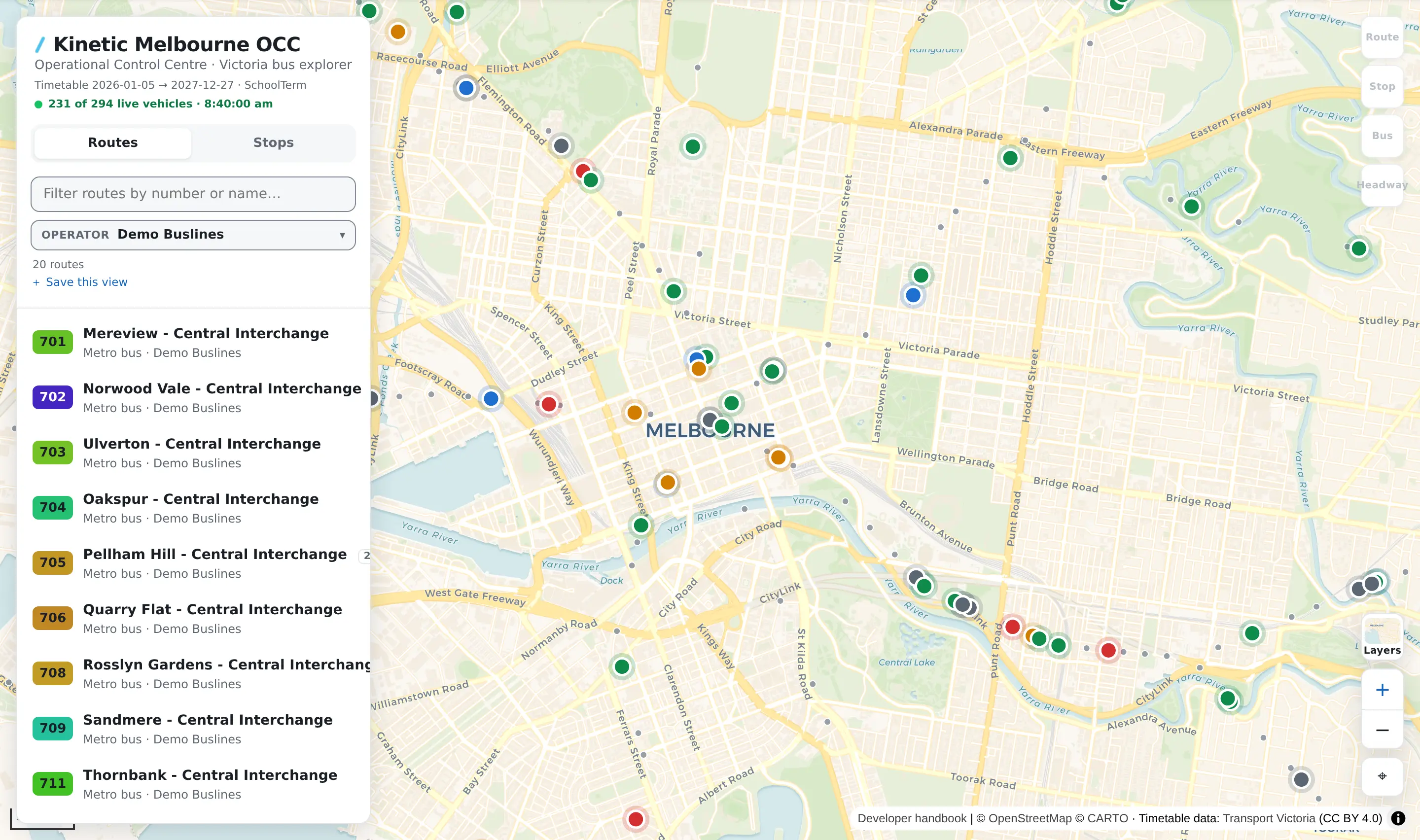
Every colour in the table below is in that picture, grey included.
The bands are the Victorian on-time-running definitions. The dot carries four of them, plus grey:
| Colour | Band | The bus is |
|---|---|---|
| Blue | Early | More than 1 minute ahead of its booked time |
| Green | On time | Between 1 minute early and 5 minutes late |
| Amber | Late | More than 5 and up to 10 minutes late |
| Red | Very late | More than 10 minutes late |
| Grey | No prediction | Nobody has said how this bus is running |
The words are always the real number. Hover a bus and the box says 4 min late in the on-time colour, because four minutes late is on time by this definition. Colour follows the band; the text reports the deviation. They are not disagreeing.
Two details worth carrying:
- The scale is not symmetric. Five minutes late is still on time; two minutes early is not. That is the standard, not a setting.
- Early is one colour for two cases. A bus three minutes ahead and a bus twenty minutes ahead are the same blue on the map. The number is on the tooltip and in the Bus panel.
Grey: the one that matters
Grey means no prediction was published for that bus. It is not "on time".
Two situations produce it, and both mean the same thing to you:
- the run this bus is working is not in the prediction feed at all;
- it is in the feed, and the feed carries no prediction for it.
Either way: nobody has said how this bus is running. It is the absence of an answer, and it is drawn as its own colour on purpose. A bus that really is running to time is drawn green, in the on-time colour, not grey.
Why this is worth a paragraph. Positions and predictions arrive on separate channels, so the map can place every bus in the city perfectly while knowing nothing about how any of them is doing. If grey were folded into green, a network the app knows nothing about would look like a network running perfectly — and it would look that way at a glance, across a whole screen, which is exactly the reading a controller takes without stopping to check. A screen full of grey means the predictions have stopped, not that the fleet is fine.
What they do not mean
Colour is not the road. The dot compares one bus with its own timetable. It says nothing about traffic; the Traffic overlay is a separate scale and a separate question — see Live congestion.
Lateness is not headway. Two buses both running twelve minutes late are running exactly the gap they were meant to, and the Frequency overlay will raise nothing about them; a bus that is dead on time can still be sitting on the back of the one in front. The two use different bands and different colours on purpose, and neither is derived from the other. See Bus frequency and headway.
"Late" is against the timetable that is loaded here. If a newer timetable has been published and this deployment is still on the previous one, the predictions are being measured against a schedule the app may no longer hold. The dates the loaded timetable covers are printed under the sidebar heading.
A bus you cannot see is not a bus that is not running. It may not be reporting, it may be hidden by your Operator filter, or the Buses tile may be off. The live line tells you which — see below.
The count is not the fleet. It counts vehicles in the feed right now, after your filters. Buses that are out and not reporting are in nobody's count.
"Live" means "last published", not "this instant". Every dot is where the bus was when it last reported, which the Bus panel puts an age on.
Reading the live line
It is the fastest way to tell the failures apart.
| The live line says | What it means |
|---|---|
| It is not there at all | This deployment has no live bus feed. There is no Buses tile either, and the app is a schedule explorer by setup |
| Live: waiting for vehicles… | The feed is connected and reported no vehicles. At 03:00 that is the truth |
| 1463 live vehicles · 14:32:05 | The count, and the time the feed itself was generated — not the time you looked |
| 212 of 1463 live vehicles | Your Operator filter is narrowing what is drawn |
| 6 live on this route | You have a route selected, so only its buses are drawn. Clear the route for the network again |
| 1463 live vehicles (stale) | The most recent attempt to fetch the feed failed. The dots on screen are the last positions that did arrive, drawn faded to say so |
Switching Buses off hides the dots and stops nothing: the counts stay honest and switching back is instant.
When it looks wrong
Every bus is grey. The predictions have stopped arriving. Positions are still fine, which is why the map still looks populated.
Every bus is the same blue. Either Colour live buses by is set to Which way it is going, or this deployment has no predictions and the choice is not offered. Check ⚙ Settings first.
The buses are faded. The feed is stale — the last fetch failed. They are real buses at their last known positions.
There are no buses at all. Work down The map looks wrong, which takes the live line state by state.