
Manual / Operations analysis
Allocation
- For
- a controller asking what else a late bus will hit, and a scheduler looking for shifts with no recovery in them
- Status
- current
- Covers
- the Operations Analysis tab's Shifts (drivers), Runs (buses), Handoffs and Analytics sections
- Last checked against the app
6f7727e(2026-08-19)
How the day's work is allocated — which driver does what, which bus does what, where the two chains cross, and how much slack there is when they do. Four sections, and they are the reason the tab exists.
Not to be confused with the other one. The Timetable tab has a view called Allocation as well, and it is a different question entirely: where the timetable's running time goes between one stop and the next. That one is The Allocation view. Operations Analysis has no view of that name.
Shifts (drivers)
Every driver day, ranked by how easily a delay would cascade through it.
Four controls above the list — Depot, Day, Fleet and Sort. Sort offers Most fragile, Most tight turnarounds, Longest worked and Most services.
| Column | What it is |
|---|---|
| Shift | The shift's number on the roster |
| Depot | Where it signs on and off |
| Day | Which day type it belongs to |
| Fleet | The class of bus it is rostered on |
| Services | Passenger trips in it |
| Buses | How many different buses it works, with the number of bus changes under it |
| Tight t/a | Tight turnarounds inside it — same bus, under five minutes |
| Min t/a | Its shortest turnaround of the day |
| Worked | Time counted as worked |
| Fragility | The cascade-risk score, 0–100 |
Open a shift and a drawer gives you its whole day: the shift's depot, day type, fleet, sign-on to sign-off and worked time; a strip of counts; a chip per bus it works, which you can click to jump to that bus's own day; a timeline of every leg on a time axis; a Propagation & bus changes box listing where a delay would carry and where the driver steps onto a different vehicle; and Block timeline (legs in order), every service, dead run, break and changeover in sequence.
Runs (buses)
The same day, chained by vehicle instead of by driver. Five tiles above it — Runs (bus-days), Multi-driver buses, Driver handoffs, Tight handoffs and Fragile buses — then Depot, Day, Route and Sort, where sort offers Most fragile bus, Most driver handoffs, Most drivers, Most services and Longest day.
| Column | What it is |
|---|---|
| Run (bus) | The bus's identifier for the day |
| Route(s) | Every route it works |
| Depot(s) | The depots of the drivers who work it |
| Day | Its day type |
| Drivers | How many drivers take it over the course of the day |
| Services | Passenger trips it operates |
| Handoffs | Times it passes to a new driver |
| Tight t/a | Its tight turnarounds, including any that fall across a handoff |
| Span | First thing to last thing |
| Vehicle fragility | The cascade-risk score for the bus |
Open a bus and its drawer shows the whole day with each driver's stretch in a different colour, so a vehicle passing from hand to hand reads as a change of colour along the timeline, with the handoffs marked.
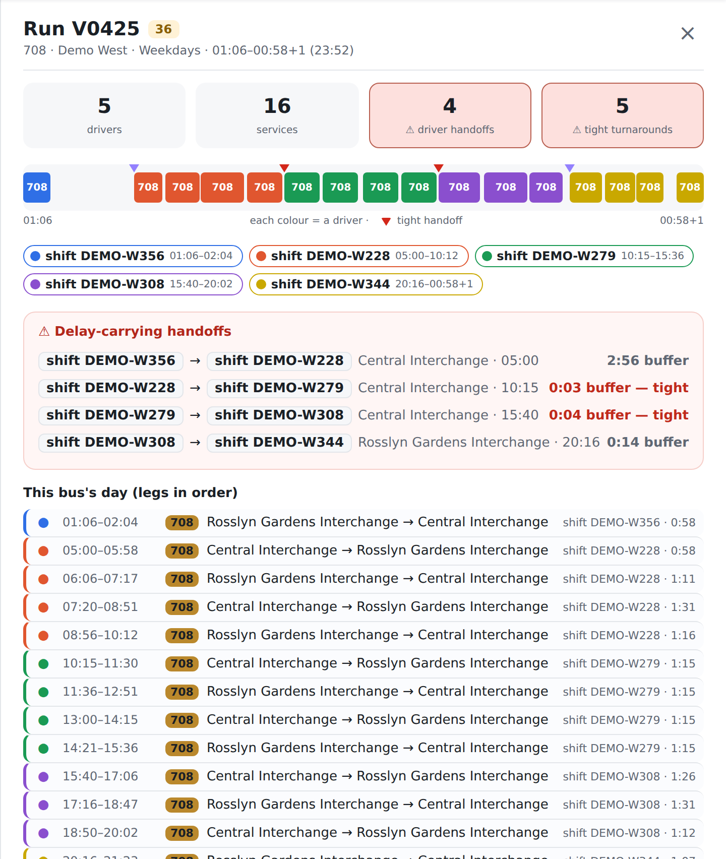
Handoffs
Every point where one physical bus passes between two drivers. A Show control offers Tight only — the default — and All handoffs.
| Column | What it is |
|---|---|
| Run (bus) | The bus being handed over |
| Route(s) | What it is working |
| Day | Its day type |
| At | The time of the handover |
| Location | The relief point |
| From driver / To driver | The shift numbers either side. Not names — see below |
| Buffer | How long there is between the incoming bus arriving and the outgoing work starting |
Rows flagged tight leave the relief driver little or nothing to absorb a late arrival with. Clicking a row opens that bus's whole day.
Analytics
Seven roster-wide cards and a simulator.
| Card | What it answers |
|---|---|
| When tightness peaks | Tight turnarounds and tight handoffs by hour of the service day, as a heat map — the windows with the least buffer |
| Turnaround-gap distribution | Every same-bus turnaround by its buffer, in one-minute bins, with anything under five minutes marked tight |
| Interlining — delay inheritance | Where a bus runs one route and then another on a tight turnaround, so the second inherits the first's lateness |
| Slack economics by depot | Average turnaround, average meal break, shortest turnaround, and how much empty running each depot absorbs |
| Handoff hot-spots | The relief points where buses most often change drivers, and what share of those handovers are tight |
| Most fragile routes | Average driver fragility per route, for routes worked by two or more shifts |
| Duty-time compliance | Long spread, a first break placed late, and no break at all |
| Delay-cascade simulator | Pick a Bus (run), an Inject at leg and a Delay (min), press Simulate, and watch the delay walk down the bus's day |
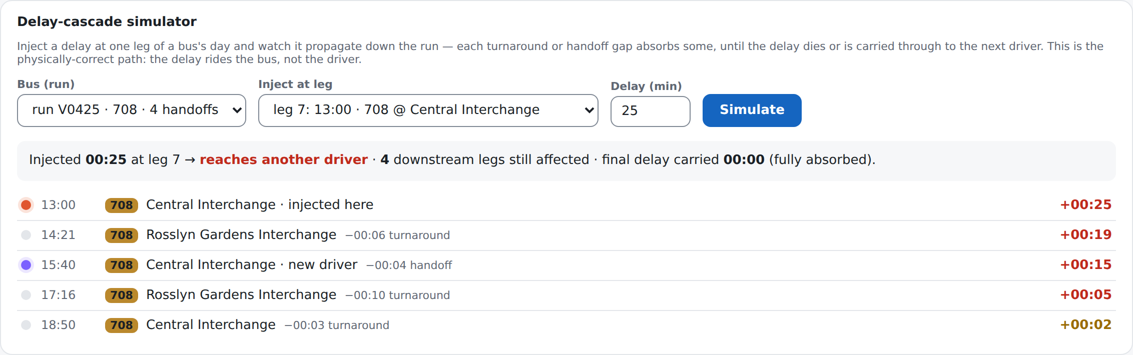
The simulator reports whether the delay reaches another driver, how many downstream legs are still affected, and how much delay is still being carried at the end — with each gap along the way shown absorbing what it can.
What fragility is
A score from 0 to 100, worked out from the roster's own chain and nothing else. It rises with two things: what share of a shift's turnarounds are tight, and how short the shortest one is. A shift whose services are separated by breaks or generous layovers scores near zero; one that strings trips back to back with three minutes between them scores high.
The same arithmetic is run over the bus's turnarounds to give vehicle fragility, including the turnarounds that fall across a driver handoff — because the bus, and its delay, carries through.
What they do not mean
Fragility is a forecast, not an observation, and never a person. It says this chain has little room to absorb a delay. It does not say a delay happened, that this shift runs late, or anything whatever about whoever works it. The roster the app reads carries no names.
The two fragility scores are not comparable. A shift's measures a driver's day; a bus's measures a vehicle's, over a different set of turnarounds. A 55 in one column and a 55 in the other are not the same statement.
The badge colour and the "fragile" counts use different lines. The Fragile shifts and Fragile buses tiles count scores of 50 or more; the coloured badge on a row steps at 30 and again at 60. A row can carry the middle colour and still be inside the fragile count, or outside it.
The cascade simulator is a what-if. It assumes every gap absorbs its full length and that nothing else in the day recovers any time — no short-turning, no running early, no controller intervening. It is the shape of the risk, not a prediction of the afternoon.
"Reaches another driver" is about the chain, not about blame. It means the bus is still late when it is handed over, so the next stretch of work starts late too.
A tight handoff is not a broken handoff. It is one with no buffer. Most of the time nothing happens; the point of the card is that when something does, it is the same relief points every time.
From driver and To driver are shift numbers. Those two column headings name the role; what is printed is the shift each side of the handover, with its depot under it. This tab cannot tell you who was on.
Three of the cards are leaderboards, not lists. Handoff hot-spots shows the busiest fifteen relief points and says so; Interlining shows the fifteen most contaminating route pairs and Most fragile routes the top twenty, and neither of those two says how many it is showing. None of the three is the whole picture.
Most fragile routes leaves out routes worked by a single shift, on purpose: one extreme shift would otherwise top the ranking on its own.
Duty-time compliance is this app's own set of thresholds, not a regulation. Long spread means twelve hours or more from sign-on to sign-off; a late first break means five hours or more before it. They are risk flags for a human to look at, and they are not a determination that anything is non-compliant.
Compound risk is narrower than the tile's own note. The note reads "two or more flags"; what the figure counts is shifts that are both long-spread and fragile — 50 or more. A shift with a late meal and no break carries two flags and is not in that count.
The list under the compliance tiles is not everything the tiles counted. It holds the shifts flagged for a long spread or a late first break. A shift whose only flag is No break is in the count above and not in the table below.
The Handoffs list stops at 500 rows and says so, sorted by tightness under Tight only and by time under All handoffs. Shifts (drivers) and Runs (buses) stop at 300. Narrow with the filters to reach the rest — and note the export holds the rows the table holds, not the rows behind them.
A gap of zero is not missing. Where the roster has one leg starting before the previous one finishes, the app treats that as a fault in the paperwork rather than an impossibly tight turnaround, and leaves it out of the tight counts. Turnaround-gap distribution reports those overlaps separately, so they are visible rather than quietly dropped.
None of these numbers is coloured by the delay bands. The fragility badges and the tight-by-hour heat map are ramps — bigger is deeper — not the five on-time-running bands the bus dots and the timetable cells wear. Nothing on this tab measures a bus against its timetable.